
Design System
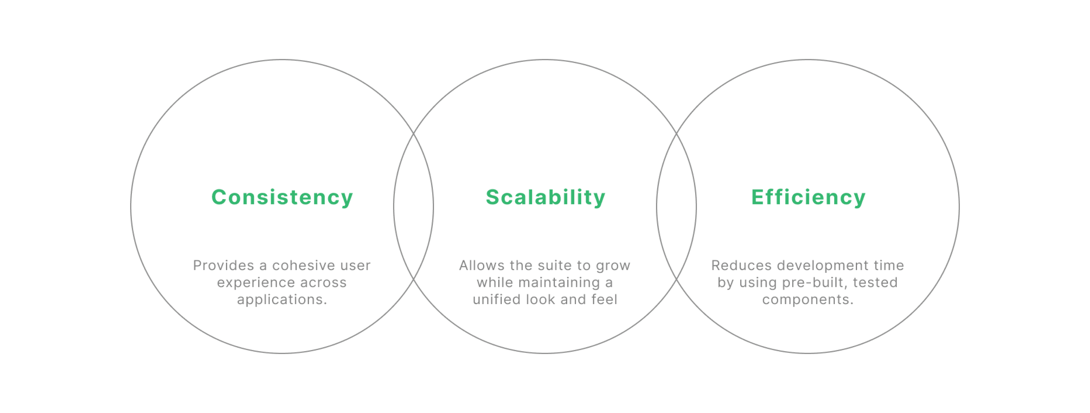
A scalable design system to drive consistency, efficiency, and delight across products. It includes flexible components, clear guidelines, and a focus on seamless user experiences.

Overview to the design system
When we set out to build this design system, the goal was clear: bring consistency and order to a suite of 10 complex
applications. It wasn’t just about creating reusable components; it was about unifying the entire experience for users
and making things more efficient for the teams working behind the scenes.
Each app had its own quirks, and without a central system, things felt disconnected.
The design system became the solution—standardizing visual elements, reducing errors, and streamlining updates—
ultimately transforming how we built and maintained these applications.
Problem
01
Inconsistent UI Components: Each web application was developed in isolation by individual team members,
leading to a lack of cohesion in visual design.
02
Redundant Workflows: Designers and developers repeatedly built similar UI components from scratch, leading
to inefficiencies.
03
Manual Updates: Every time a small design tweak was made, it had to be manually applied to each application,
which was time-consuming and prone to errors.
04
Development Bottlenecks: The absence of standardized components increased development time, with
developers having to constantly consult designers for minor design decisions.
05
Difficult Onboarding: New members joining in the future may face a steep learning curve due to decentralized
tools and components.
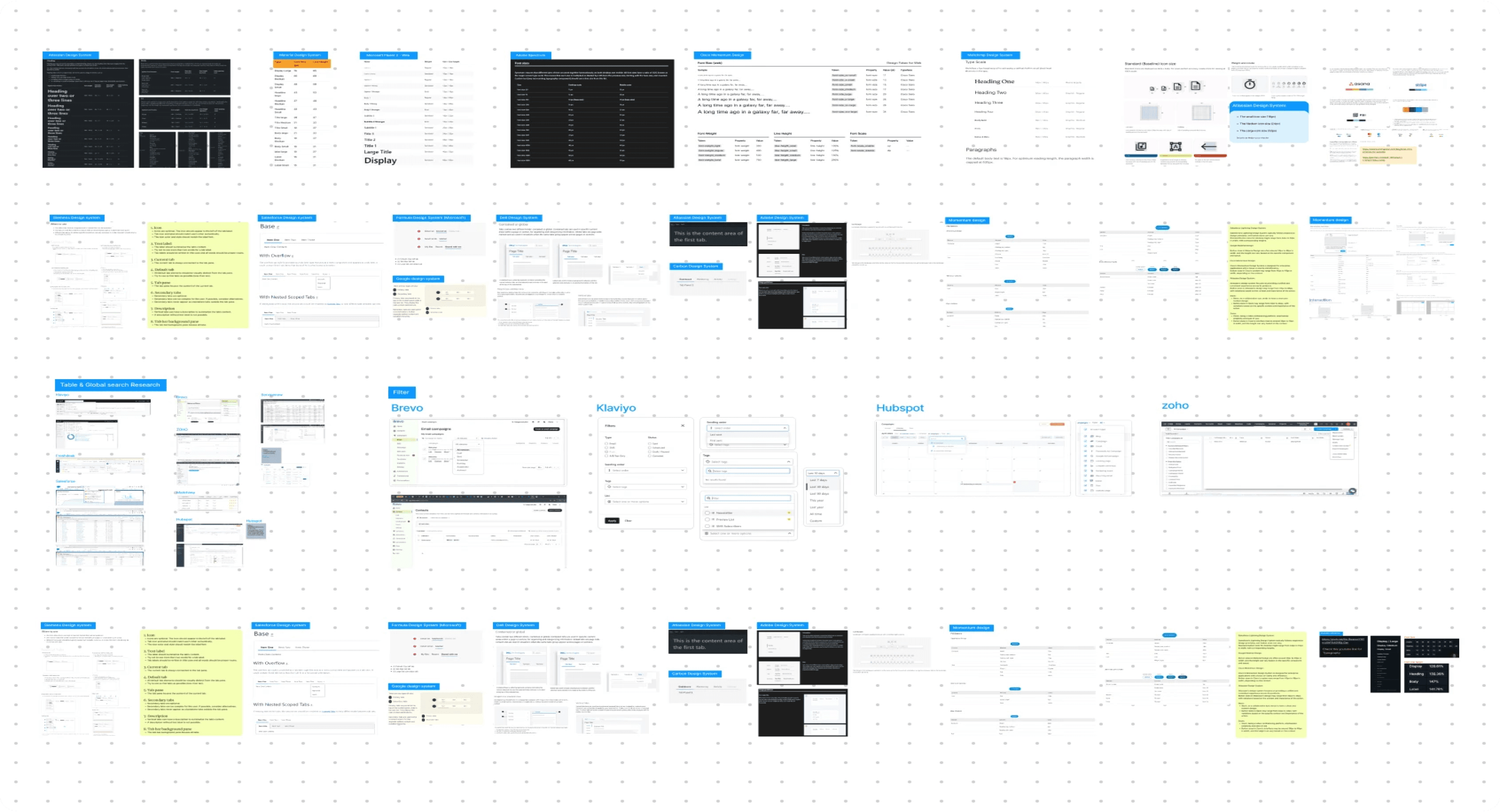
Research
We conducted extensive research into how reusable components and a unified design system could solve these
problems. Our primary focus was to create a system that would be easy to implement across the different
applications while ensuring consistency.
Solution
We built a robust design system grounded in Atomic Design Principles. This approach allowed us to break down
each application into its smallest elements

Atoms
The most basic building blocks
in a design system, like
buttons, icons, or text boxes.

Molecules
Combinations of atoms that
create functional components,
such as search bars or form
fields.
Organism
Complex structures made from
groups of molecules and atoms
that form distinct sections like
footers, navigation bars.

Templates
Layout structures that organize
multiple components into a
cohesive design.

Pages
Final compositions where
templates are filled with
content, resulting in complete,
ready-to-use web pages.
How the Design System Solves Problems
01
Inconsistency: Implementing standardized components, we eliminated visual and functional discrepancies
across applications.
02
Efficiency: Development teams can now pull from the shared component library, reducing time spent on UI
development.
03
Redundancy: Designers and developers no longer need to recreate the same elements for each application,
reducing duplication of effort.
Design
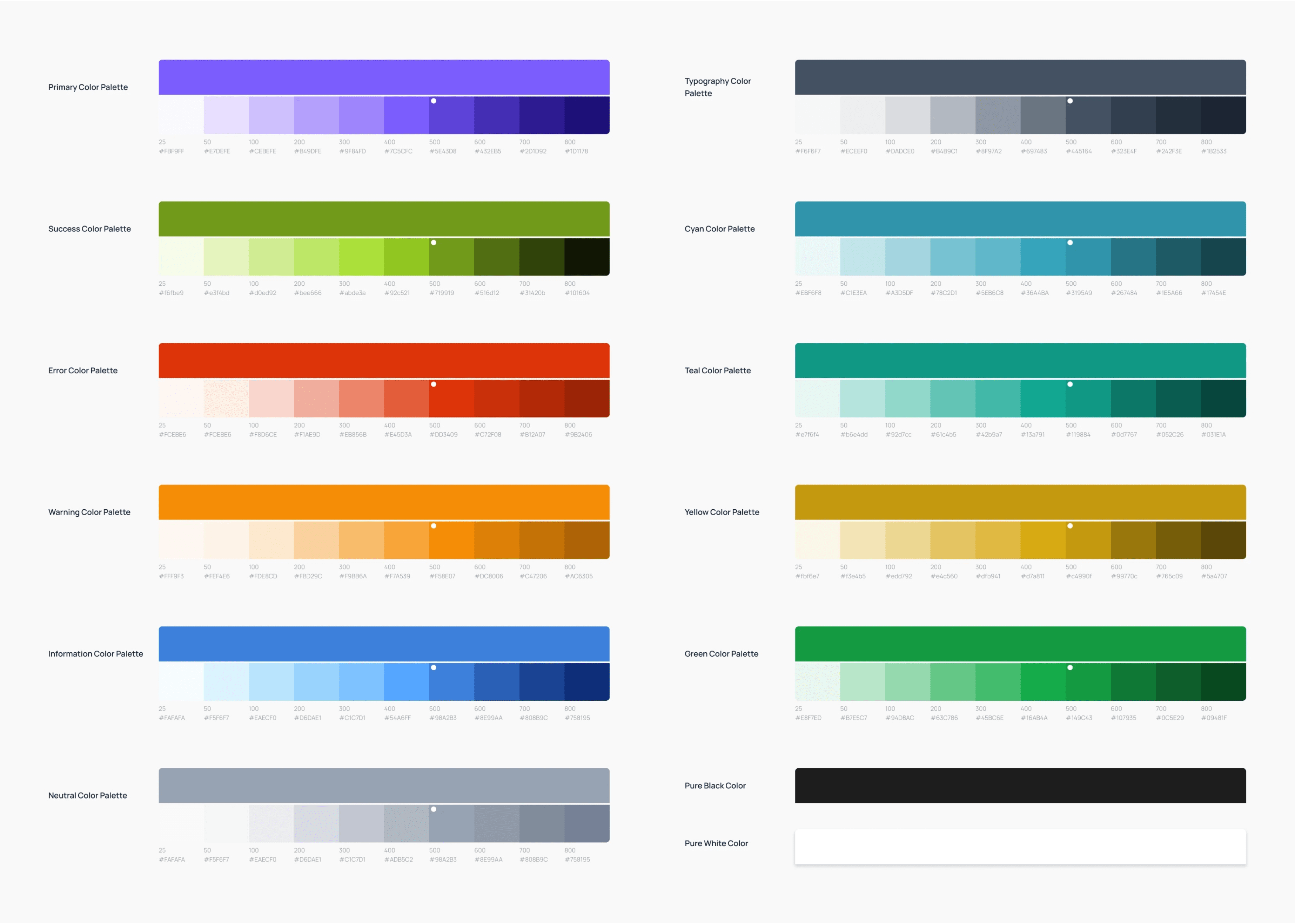
Color system
We built a robust design system grounded in Atomic Design Principles. This approach allowed us to
break down each application into its smallest elements
Typography
We standardized the Manrope font family across all applications, selecting specific sizes and weights to
create a clear hierarchy. This choice ensures readability and brand consistency, providing a modern and
approachable feel throughout the user interface.

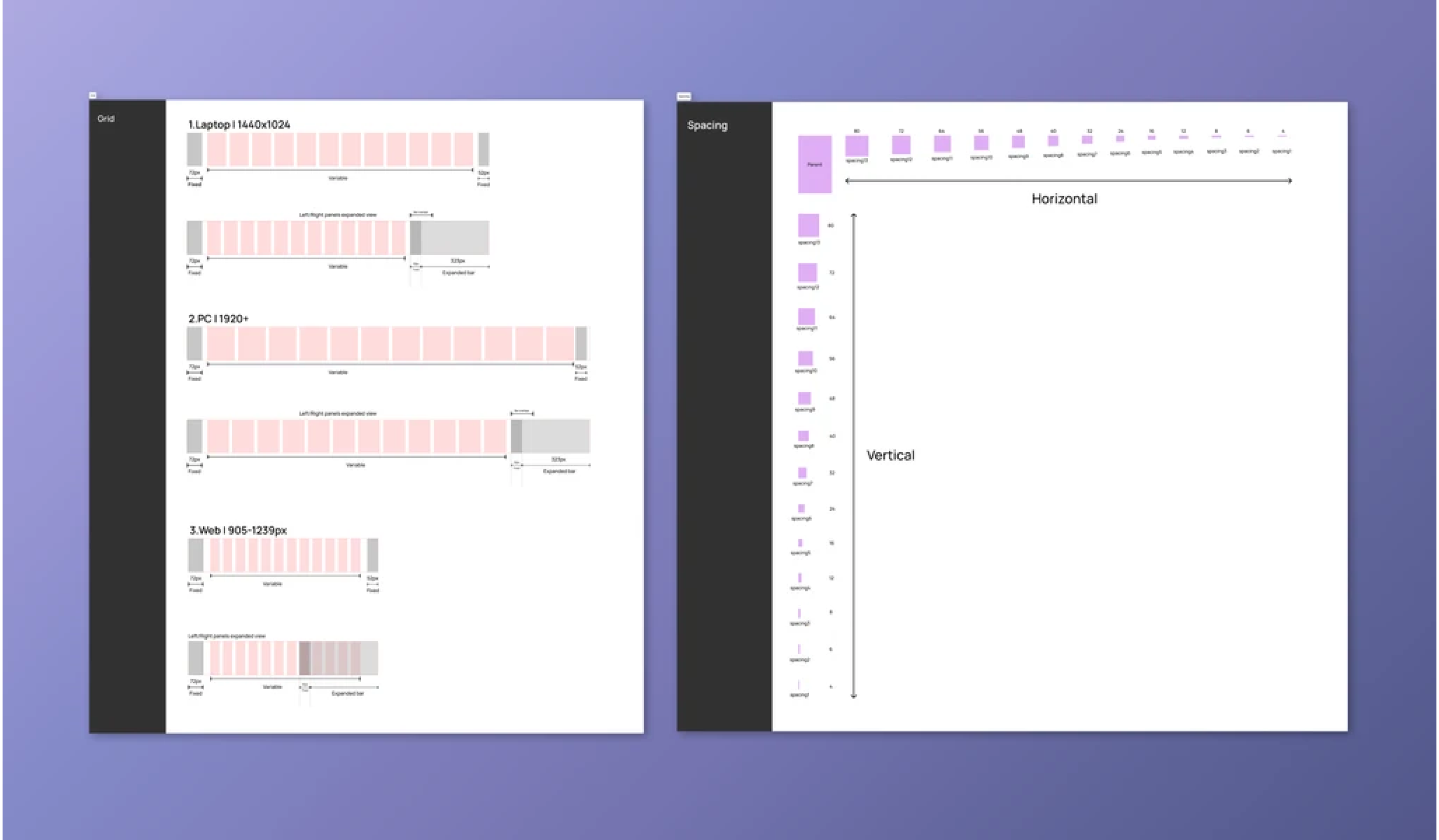
Grids and Spacing
A structured grid system, paired with consistent spacing rules, maintains visual order across
our applications. This framework improves usability by creating a predictable and balanced
layout.
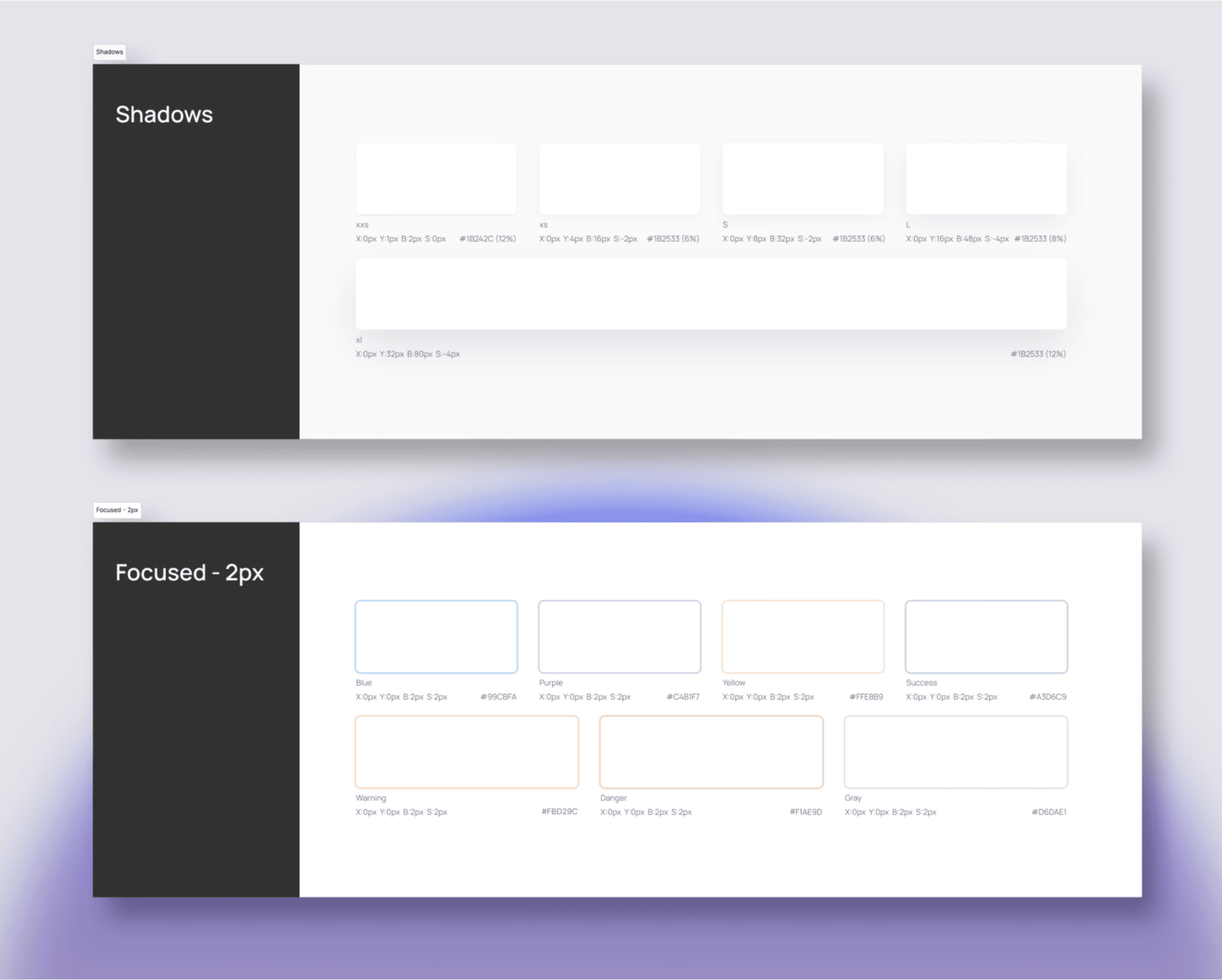
Elevation/Shadow
Consistent shadow usage adds depth and hierarchy to our UI components. These subtle
effects guide user focus and interactions, contributing to modern aesthetic that aligns with our
overall design vision.
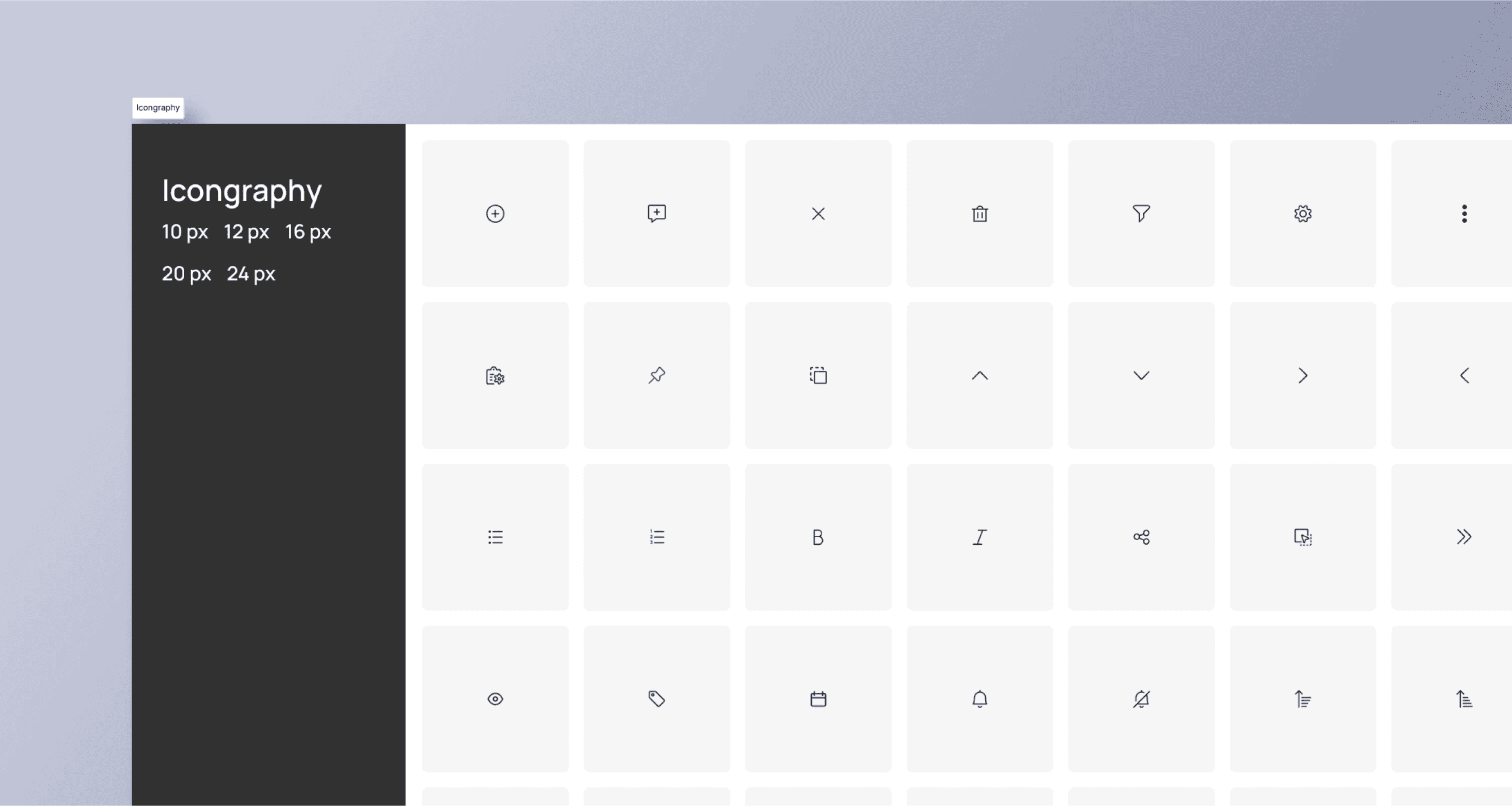
Iconography
Iconography: We incorporated icons from Streamline and Ultimate Regular, selecting them for their
clarity and alignment with our design aesthetic. These icons are used consistently throughout the suite,
ensuring that visual communication is clear and intuitive.
Buttons
The button components include Primary, Secondary, and Tertiary variants, each with states for Default,
Hovered, Pressed, Disabled, and Destructive actions. These buttons are designed to be visually distinct and
intuitive, ensuring users can easily identify their purpose. They are optimized for responsiveness, maintaining
their usability and appearance across different breakpoints.

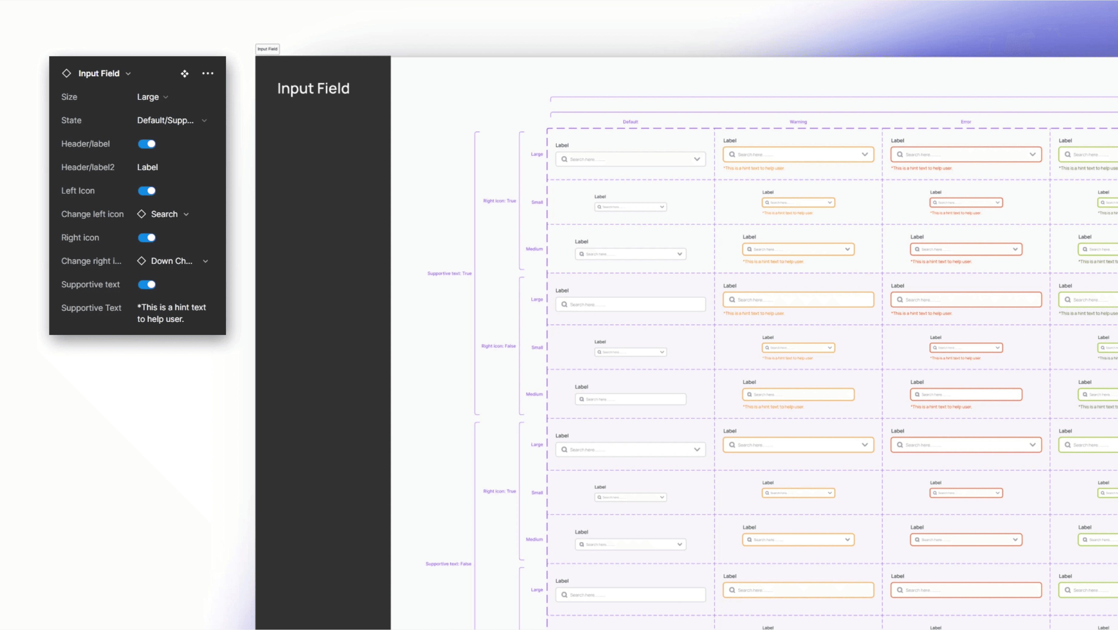
Input Fields
Our input fields come in Large, Medium, and Small sizes, each designed to be versatile and adaptable to
different contexts. The input fields support various states, including Default, Default/Supportive Text,
Warning, Error, Success, Selected, Hovered/Focused, and Disabled. These fields are optimized for
responsiveness, ensuring they function and display consistently across all modules.
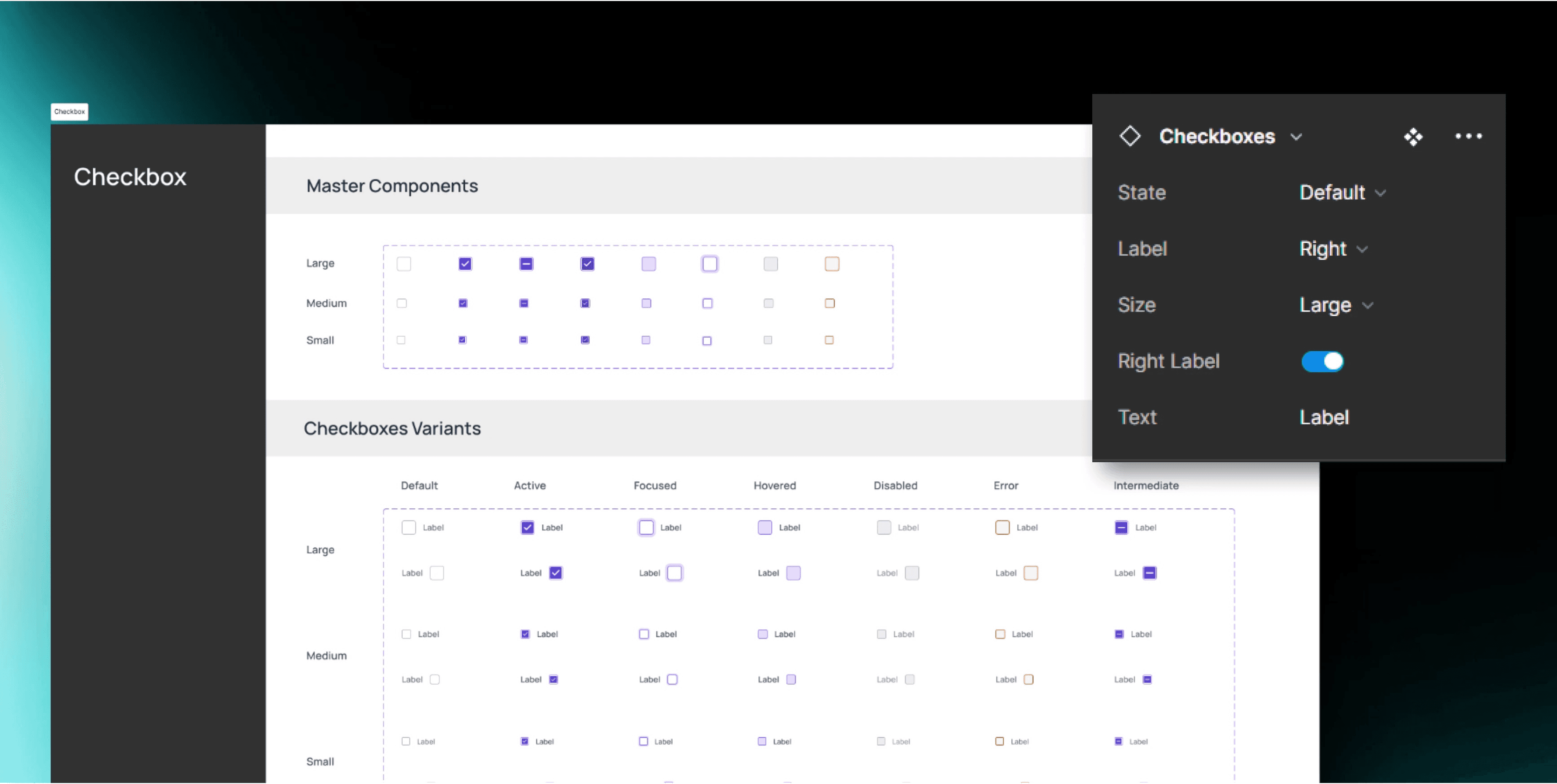
Inputs
The input components, including Checkboxes, Radio Buttons, Toggles, and Switches. These inputs are consistent
in appearance and behavior, providing clear feedback in different states, from selection to disabled modes.
Designed with responsiveness in mind, these inputs perform seamlessly across all modules, ensuring a consistent
user experience.
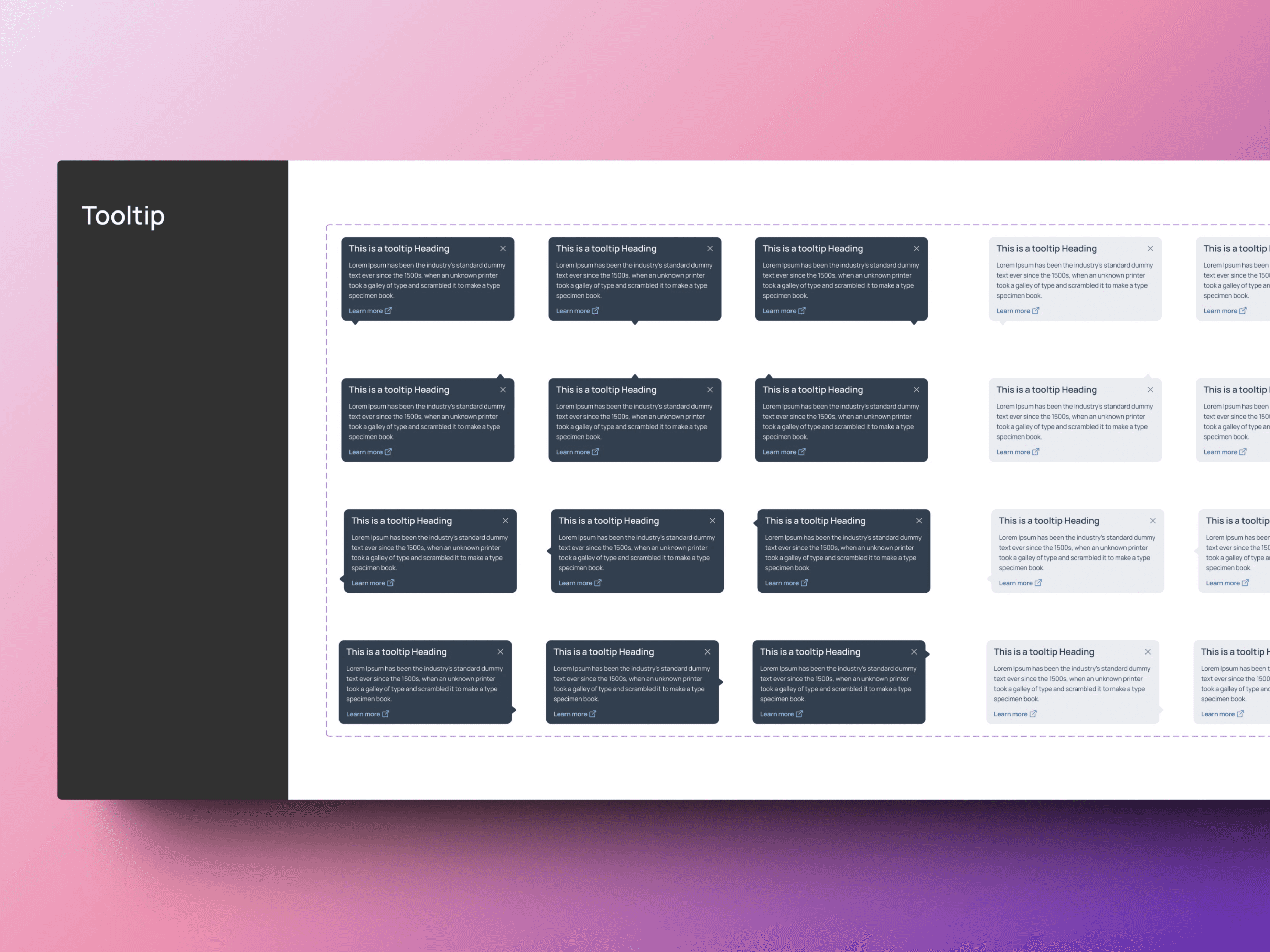
Other components
Atoms also includes Tooltips, Progress Indicators, Scrollbars, and Rating Stars and more
other still in progress —each meticulously designed to enhance usability and maintain visual
consistency across all modules.
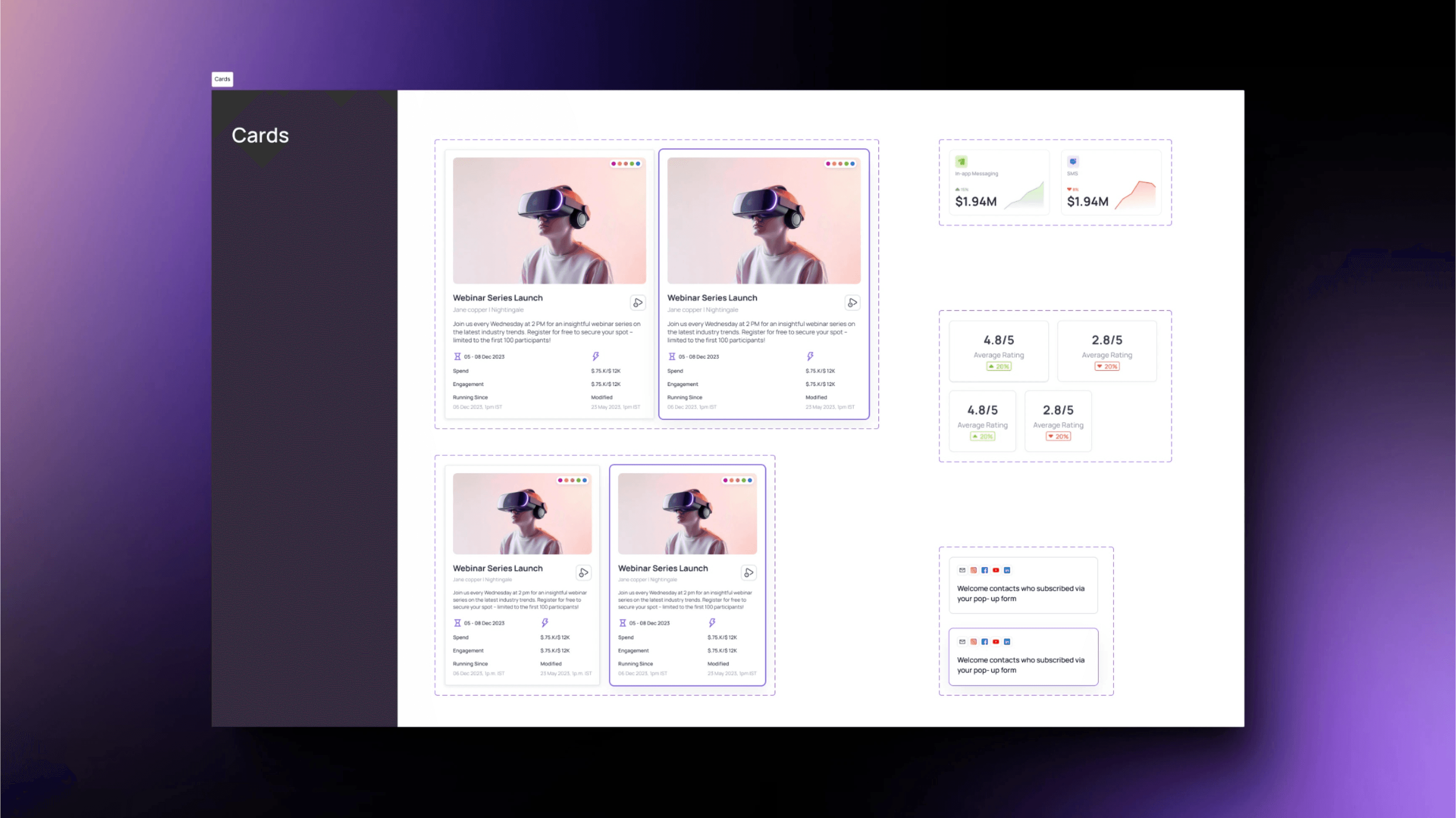
Cards
The Cards component features both standard and data display designs, optimized for clear and organized
information presentation. These cards maintain consistency in layout, icons, and typography, ensuring a cohesive
look across all 10 modules. Their responsive design adapts seamlessly to any screen size, making them versatile
and effective throughout the enterprise suite.
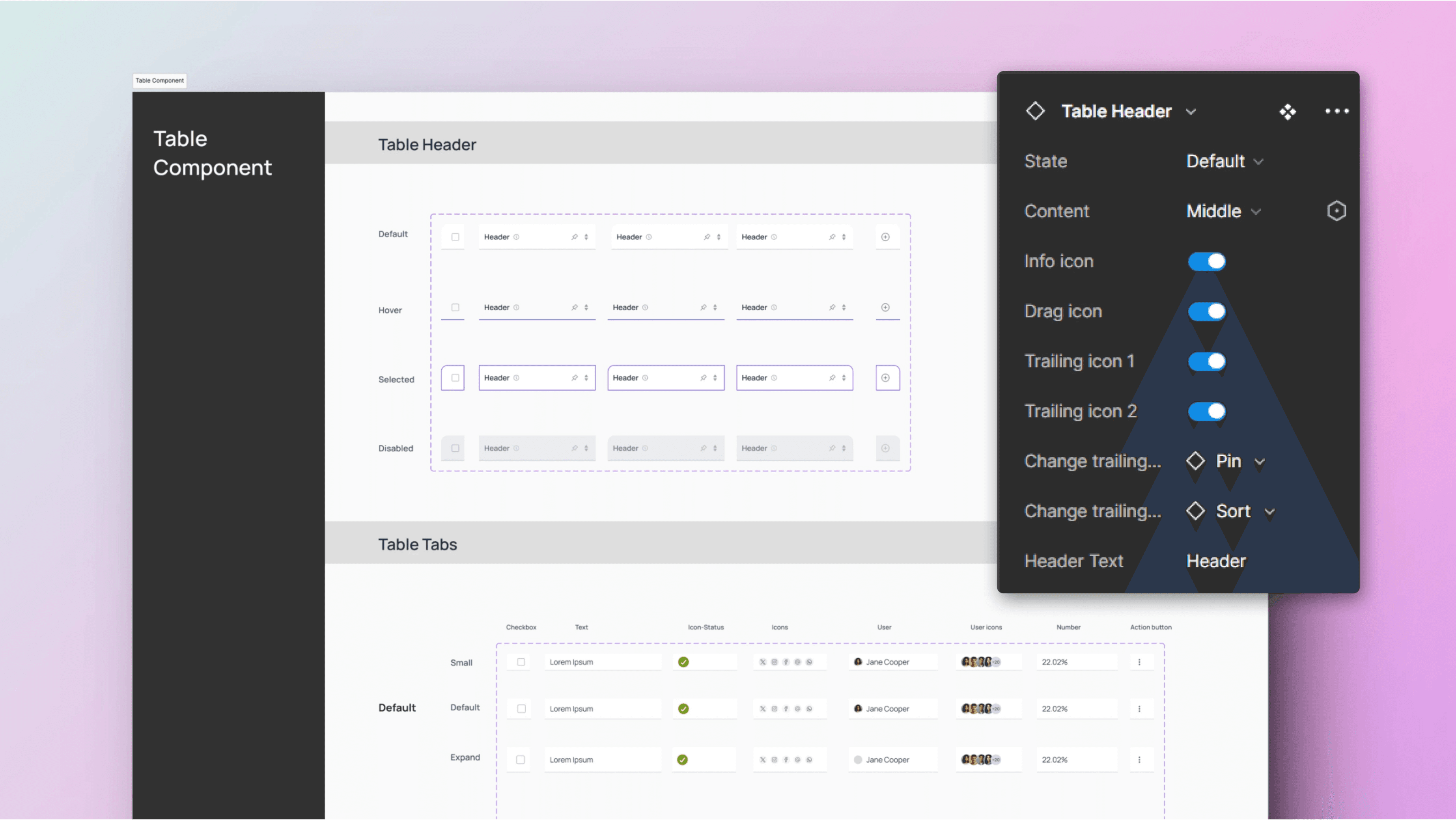
Table
components
Table components are designed for efficient data management across the suite. The table headers
feature states like Default, Hover, Selected, and Disabled, providing clarity during user interactions.
The tables come in Small, Default, and Expanded sizes, accommodating various content types such as
Checkboxes, Text fields, Icons, User and Admin info, Numbers, and Action buttons. Each element is
responsive to different interaction states, ensuring a consistent and intuitive experience across all
modules.
Calendar
components
The Calendar components are designed for versatility, featuring master elements like buttons, tabs,
and date cells in Small and Large sizes. The calendar supports Day, Week, Month, and Year views, with
or without side filters, providing efficient date selection across all modules.
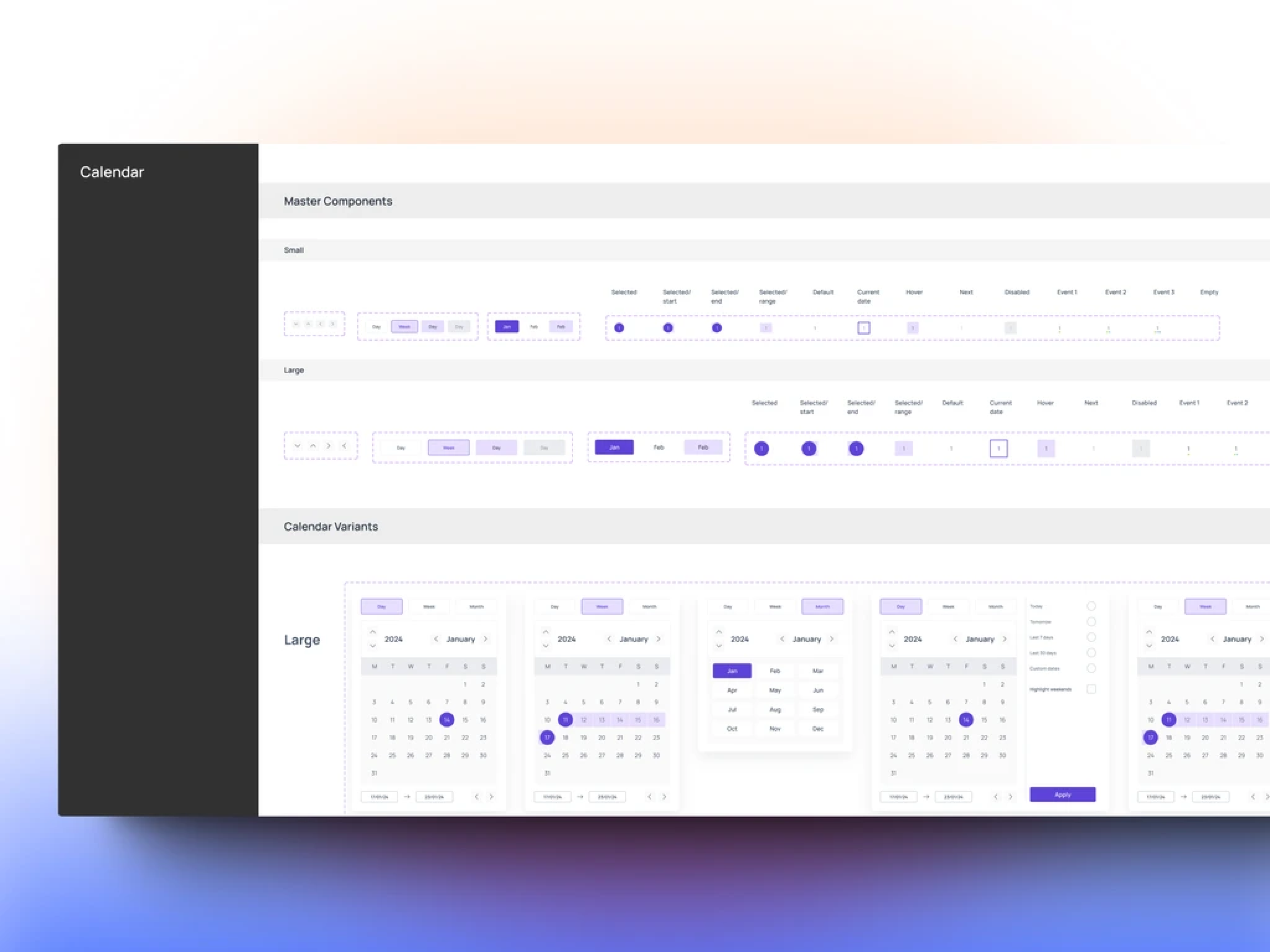
Table layout
The design system provides versatile Table layouts in Small, Default, and Expanded sizes. These layouts
ensure that data is presented clearly and effectively, adapting to various content needs while maintaining
consistency across the suite's applications.

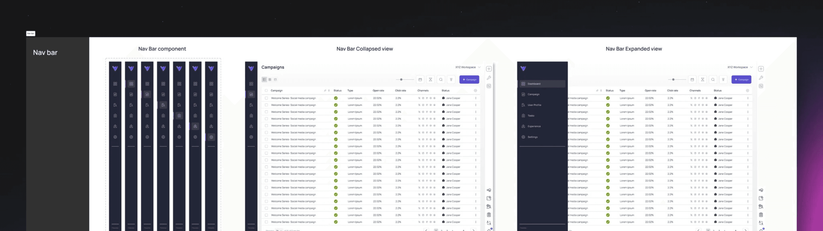
Nav bar
The Nav Bar component is designed to provide intuitive navigation with both Default and Expanded views. It
adapts seamlessly, ensuring easy access to key features while maintaining a consistent look
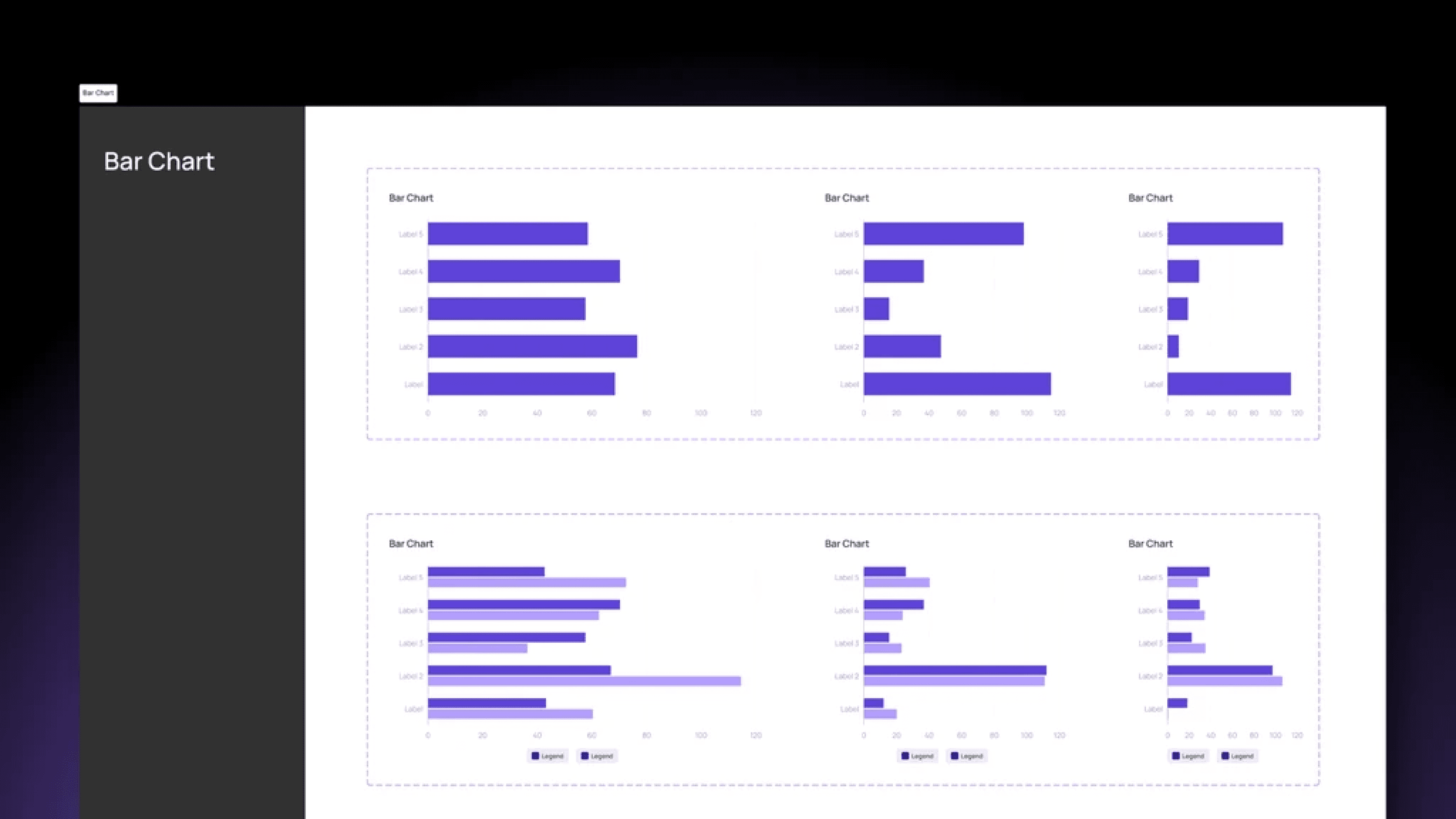
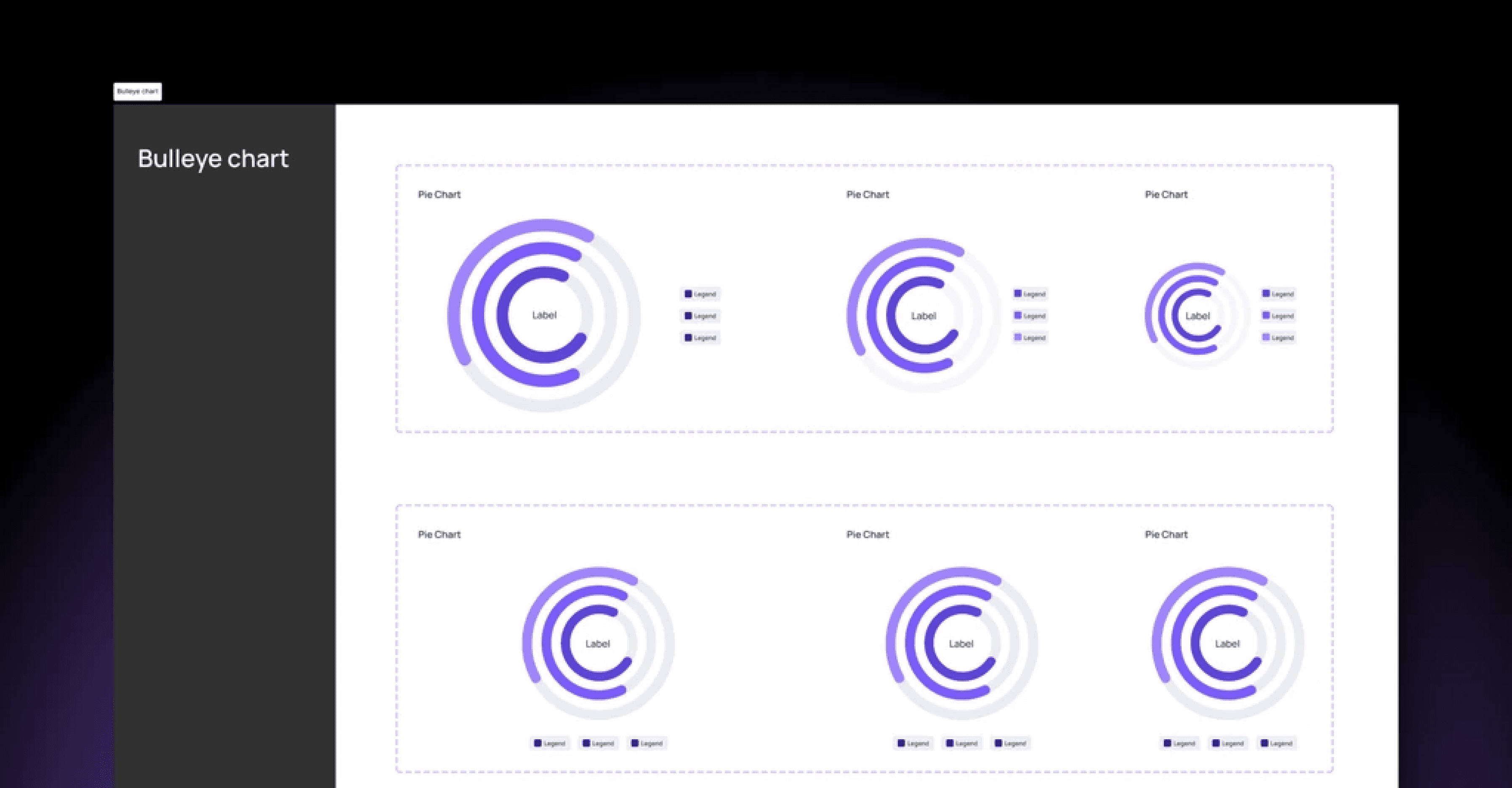
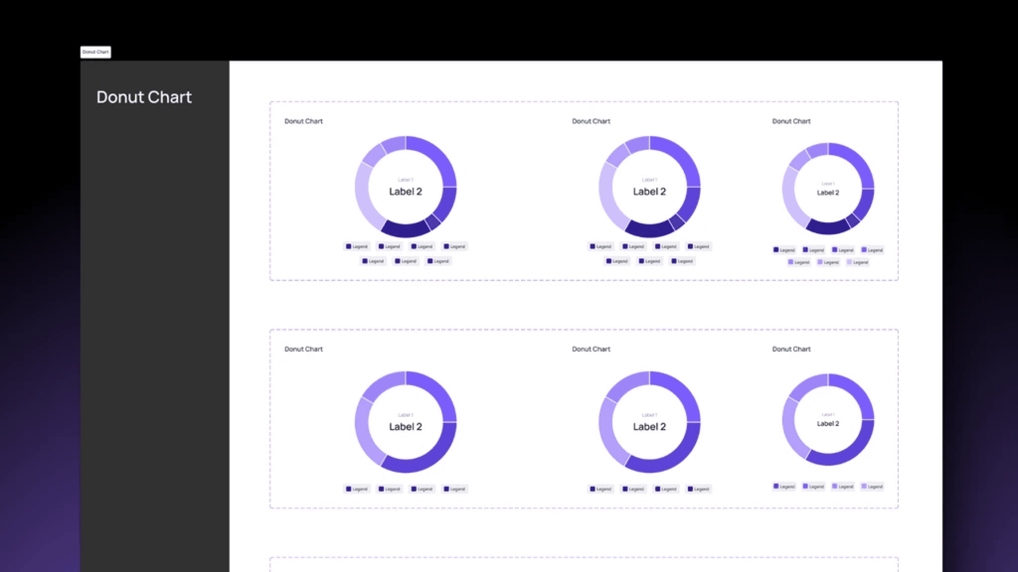
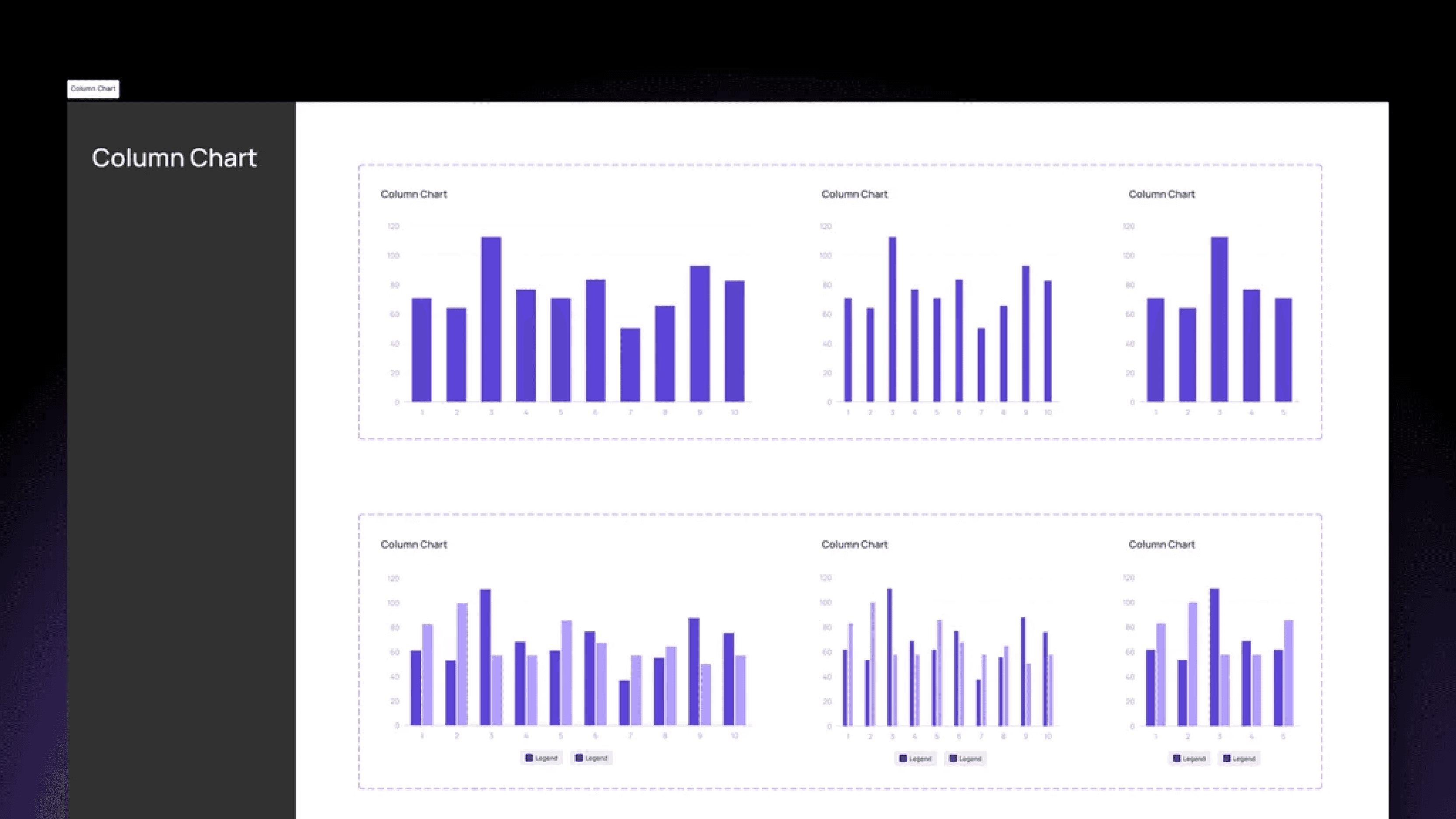
Charts/Graphs
The design system includes a comprehensive set of Charts and Graphs: Column Chart, Stacked
Column Chart, Bar Chart, Donut Chart, Line Chart, Pie Chart, and Bullseye Chart. These visual
elements are designed to present data in a clear, engaging, and easily interpretable way.


Takeaways & Learnings
Building this design system was a journey filled with challenges, learning, and growth. It pushed us to rethink our
approach to scalability, consistency, and collaboration.
01
Iterate and Adapt: We had to embrace an iterative approach, knowing design system is a living document, and it
should evolve with the needs of the product and the users
02
Focus on Scalability: From the outset, we ensured that our system was scalable, accommodating not just the
current suite but any future applications that may be added.
03
Define Component Variants Early: Establishing component variants (e.g., button sizes, Input fields styles)
upfront prevented design drift across different applications.
04
Avoid Over-Engineering: We learned not to overcomplicate the system—keeping it simple made it easier for
developers and designers to adopt.
The Conclusion
Building this design system for the enterprise web app suite was both a challenge and an incredible learning
experience. Despite being new to this kind of large-scale system design, our team successfully overcame obstacles,
created efficient workflows, and delivered a product that improved user experience, consistency, and development
efficiency. This project not only enhanced our technical skills but also strengthened our collaborative approach,
making us more effective as a team.